Orbit Innovation: New Technology Landscape
More comprehensive, the Technology Landscape dashboard has a new look:
More intuitive, easier to read, graphs have been revamped to highlight relevant data at a glance and draw attention to key elements. In addition to being more relevant, trend graphs are now using projection to predict the latest current 2 years; this allows you to better visualize the trend despite the lag time between application and publication.
5 new metrics have been added to the dashboard to allow you to deepen your analysis: Market strategy, Clinical investments, Scientific concepts, Scientific domains, and Start-up, all detailed hereafter.
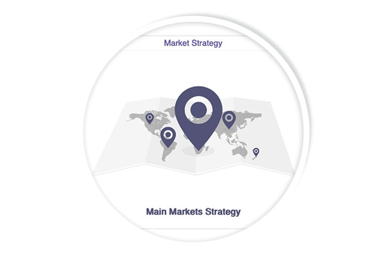
Market Strategy
At a glance, understand what the market strategy is around the technology you are studying. Is it local? Focused on the main markets or global?
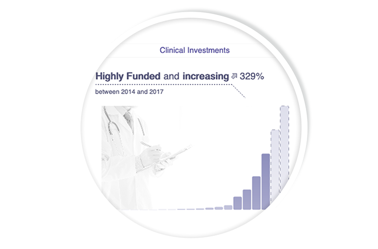
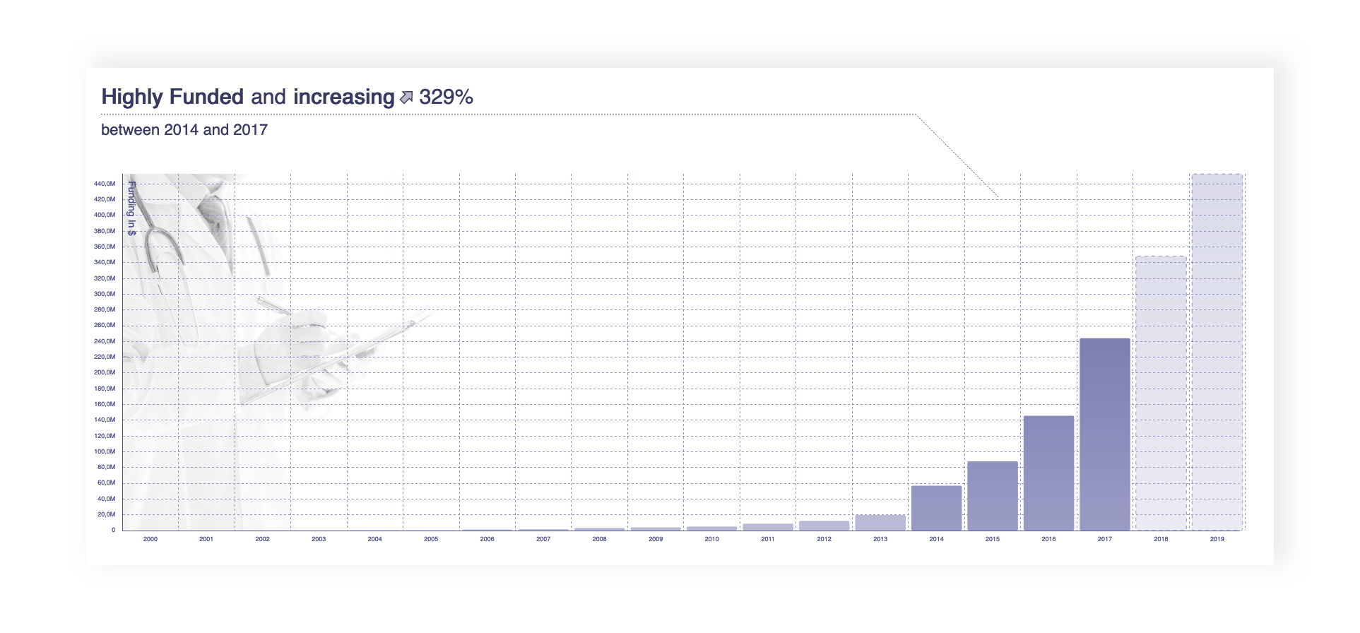
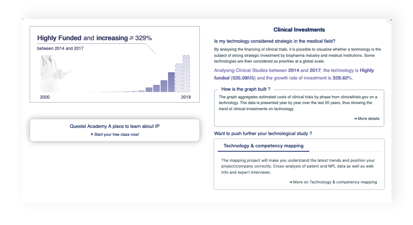
Clinical Investments
The medical challenges surrounding all technologies are now essential. The Clinical Investments graph shows whether clinical trial based investments are increasing and whether the topic is strategic for the biopharma industry. This graph complements the business analysis with IP Investments and Institutional Investments graphs.
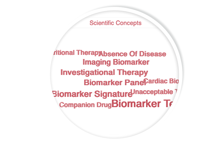
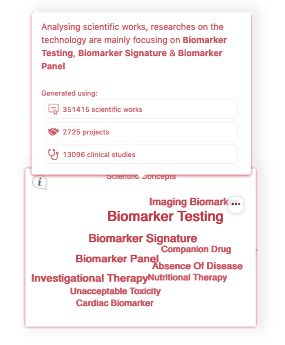
Scientific concepts
In addition to the technical concepts, you now have direct access to the scientific concepts resulting from the NPL's analysis (publications, conferences proceedings, thesis, collaborative projects...)
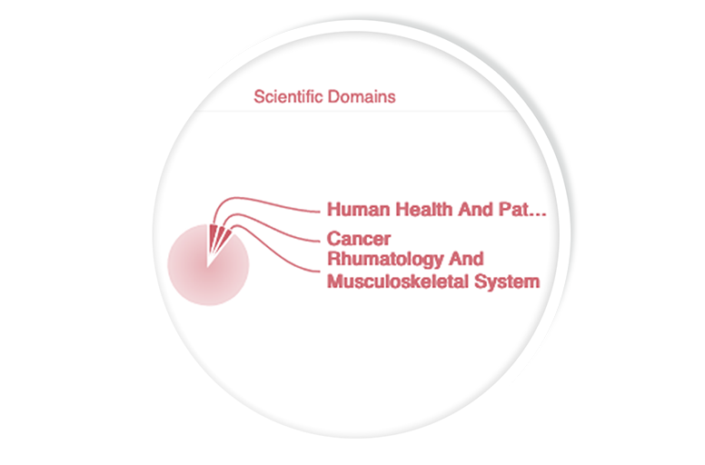
Scientific domains
Visualize in which scientific fields, the research around your technology is focused through the analysis of the NPL.
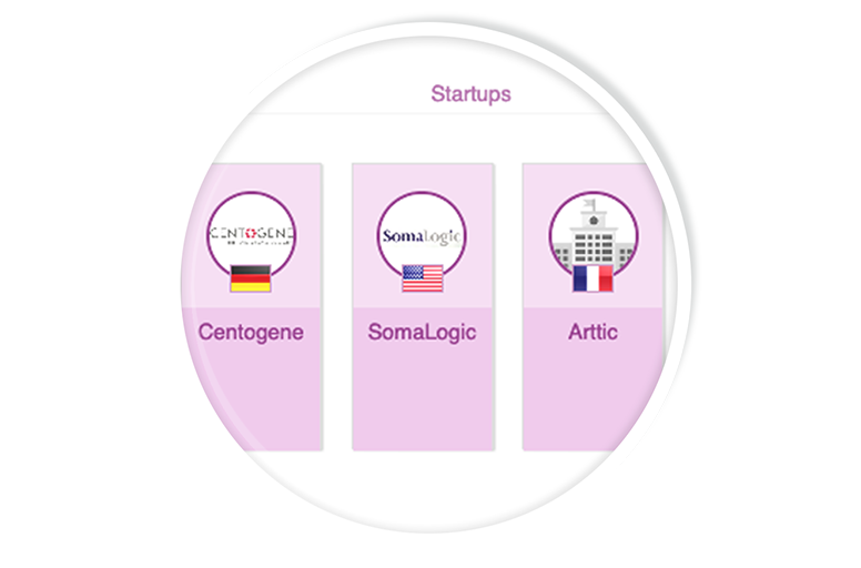
Start-ups
Already available in the Data Sourcing dashboard, start-ups are now directly accessible in the Technology Landscape dashboard.
Like all existing graphs, you can access more complete data with a simple click.
Hovering over a graph, you instantly see the type of data used to generate the metric.
Comprehensive help and analysis insights to better understand results are always accessible by clicking on the help icon.
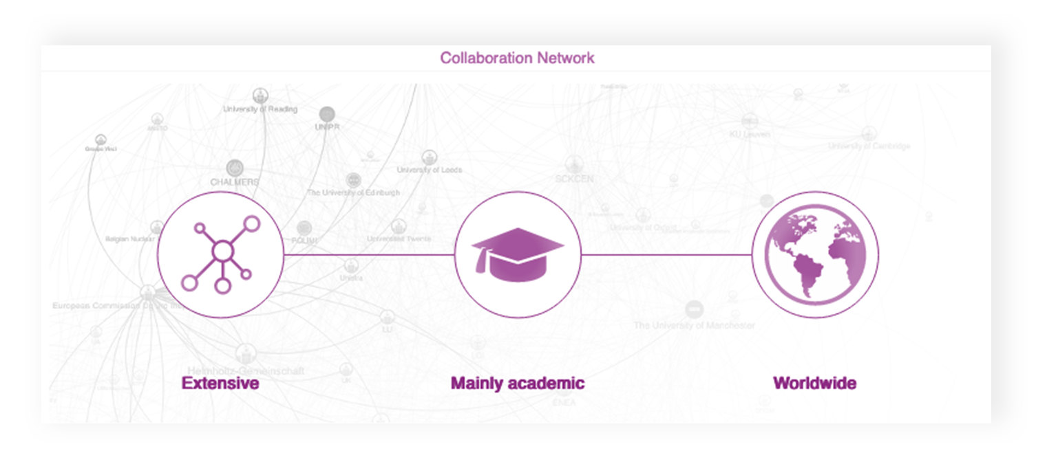
To facilitate their use and improve their readability, 2 metrics have been redesigned: Collaborative Network and IP Investments.
The Collaborative Network graph is now more visible and accessible.
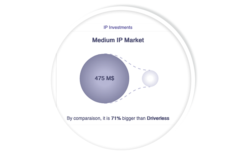
The IP Investments graph has been revamped to remain relevancy and readability at a glance, regardless of the size of the markets you are studying.