Orbit Intelligence Analysis
New 3-D benchmarking chart
Compare industry players on multiple metrics
Platinum users working in the saved analysis will now be able to access a new bubble plot chart where three different value options can be crossed. For example, on a single chart you could display, for each assignee:
- 1. Number of granted patent families
- 2. Number of non-self-citations
- 3. Average age
This can give you new insights into the data allowing you to distinguish between portfolios based on their unique strengths/weaknesses.
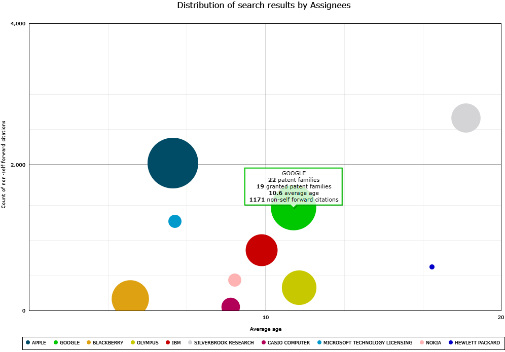
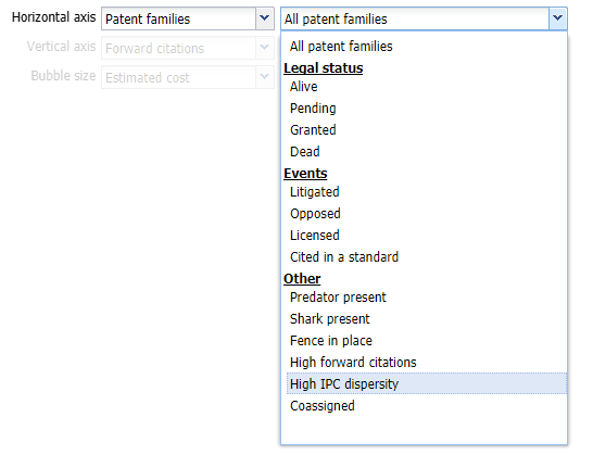
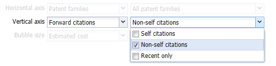
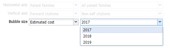
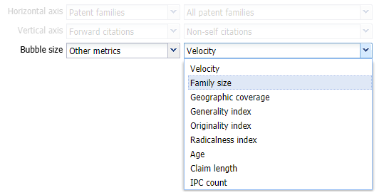
![]() Just like for all other chart types, a Settings button offers extensive customization options with a broad variety of values for each axis, as shown below. The bubble plot chart can thus provide several high value-added insights.
Just like for all other chart types, a Settings button offers extensive customization options with a broad variety of values for each axis, as shown below. The bubble plot chart can thus provide several high value-added insights.