
![]() Metrics in the saved analysis
Metrics in the saved analysis
We are pleased to announce a major improvement to the analysis module which will allow Platinum users to access 30 patent strength indicators directly from their saved analyses.
Metrics / patent strength indicators
Currently, the vast majority of the analysis performed in Orbit Intelligence are based on the count of patent families. This is in itself a fantastic metric, because the Questel patent families are invention-based you can use this metric to identify which companies, technologies, inventors etc. have the most patent inventions and how the trends are changing over time.
However, the pure number of inventions is only the tip of the iceberg. To get a better understanding of the landscape, advanced analysts are using a number of different metrics to go beyond the pure numbers game.
- Validity metrics: Certain metrics can help identify whether the patents are likely to be valid i.e. could they be relied on in litigation.
- Market coverage metrics: Others help identify what the market coverage is; one player might have a large number of patent inventions, but if the patents are only granted in one country with a small market, this could be a weak indicator.
- Technical quality metrics: Further metrics help us identify the technical quality of the inventions; have they been highly cited? Do they have characteristics which lead us to believe the inventions are particularly innovative? Are other companies closely following their work, etc.
These metrics have been available for a while within our Evaluation modules, which guide users through specific analysis workflows for specific scenarios, including portfolio pruning, licensing, technology scouting etc. Now, the same metrics are available in the freestyle analysis module to give our users the power to utilize these indicators on any of their charts.
A veritable comparison / benchmarking tool
In order for users to get the most from these new metrics, we have also added a new chart type – the Tabular bar which allows you to visualize a number of different metrics for the same Assignees, Inventors, technology groups etc. This is a great tool for helping to benchmark one portfolio’s strengths/weaknesses against other players in the same space.
Access the new functions
If you are already a Platinum user, save your analysis and you’ll automatically have access.
If you are not yet a Platinum user, do not hesitate to get in touch with us; we’ll be happy to upgrade your account so you can trial the new functionalities.
Metric definitions and additional details
Full definitions and additional details are available in the Metric definitions sheet.
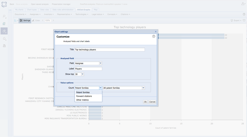
To access the new metrics, save your analysis, open a chart, click Settings, and select the metrics from the Value options menu. The metrics can be used on any of the following charts: Bar/Column chart, Pie chart, Bubble chart / Heat map, World map, Hex chart, Tag cloud.
The new tabular bar chart.
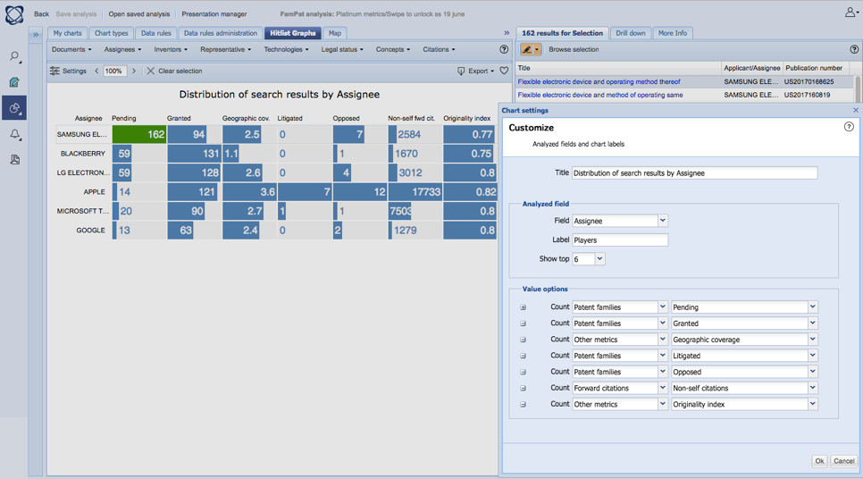
You can customise the displayed metrics from the settings menu.