
Customize your charts with ease
New menus for the analysis module
When running an analysis, you’ll notice the toolbar above each chart looks different:
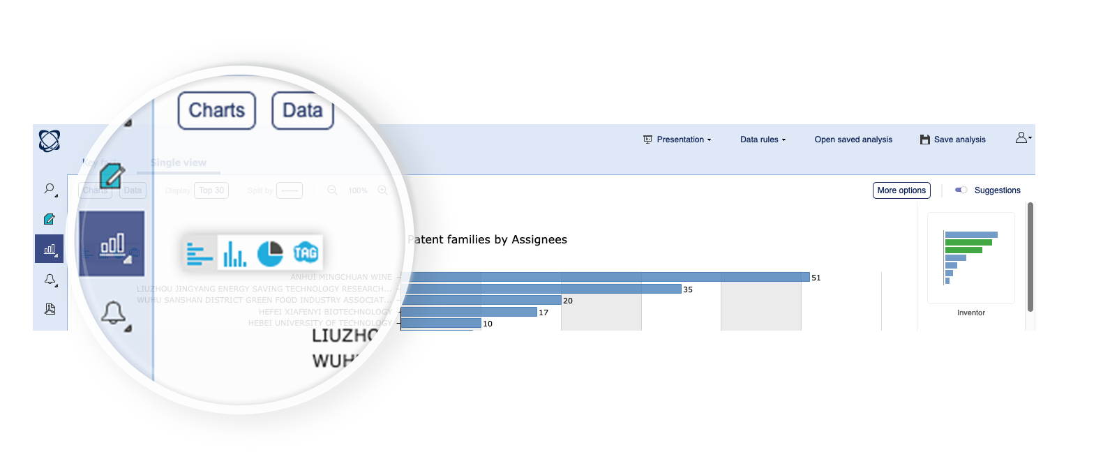
Let’s take a look at the new options; starting from the left you have the Charts menu which gives you access to the most commonly used charts. Up to here the design remains unchanged.
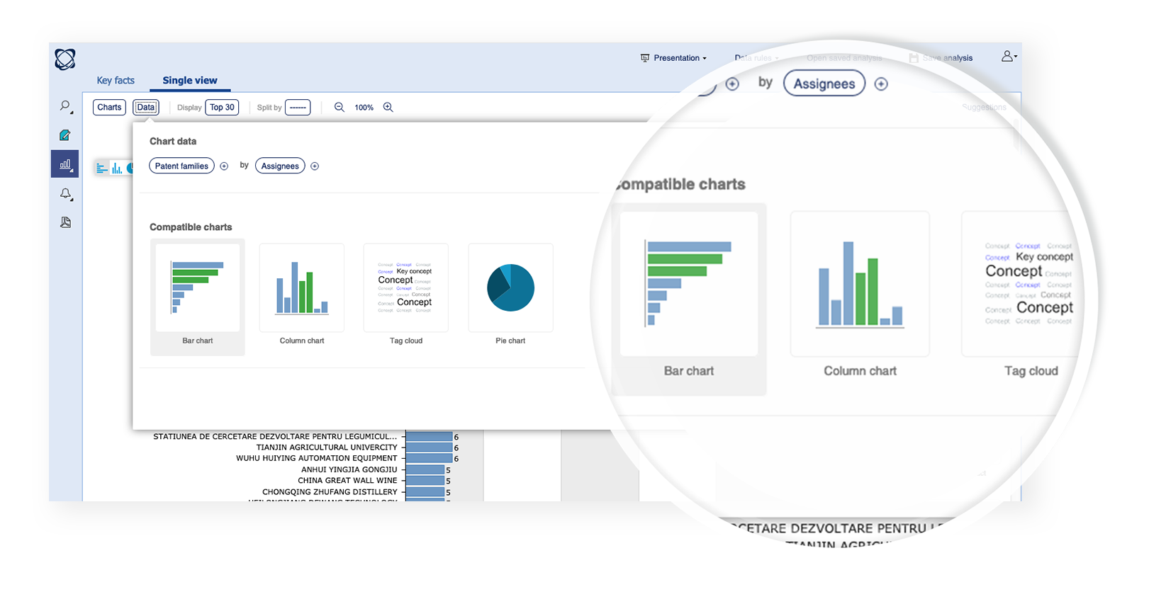
Data menu
Next up is the Data menu, this is new and allows you to customize all of the content which is displayed on the graph.
From here you can choose the data you want to display:
- Assignees
- Dates
- Classifications
- etc.
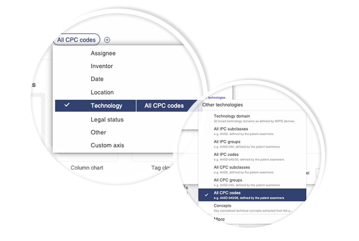
And the value options you want to see:
- Patent families
- Patent strength
- Citations
- Etc.
Once you have selected the fields you want to analyze and the value options you want to see the system will show you the available chart types.
To modify the fields displayed or the value options just click on the associated button and you’ll see a list of high-level choices:
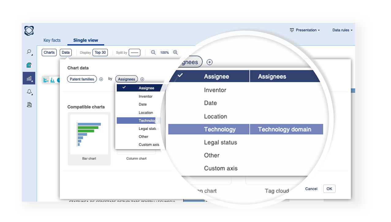
Click the link on the right to access the other options within each category:
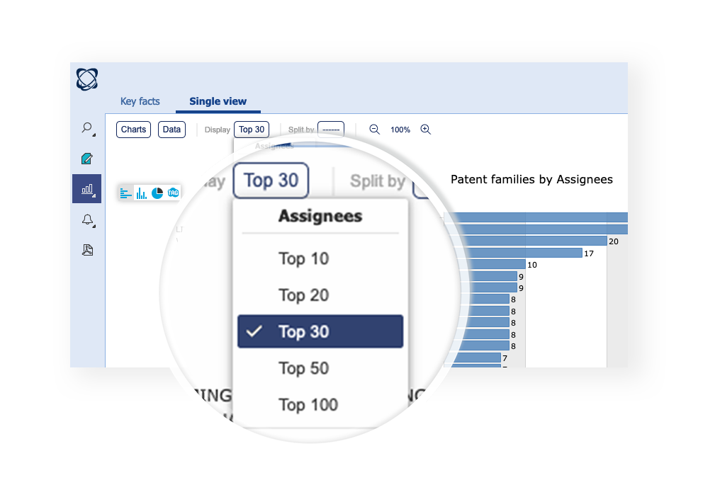
Top menu
The top menu allows you to quickly change the number of items which are currently being displayed on the chart.
Split by menu
The split by menu allows you to rapidly add another layer of information to your chart in the form of colored layers. This was previous called the “Color by” feature. Then new menu gives you fast access to a number of built in split by options, legal status, top assignees etc.
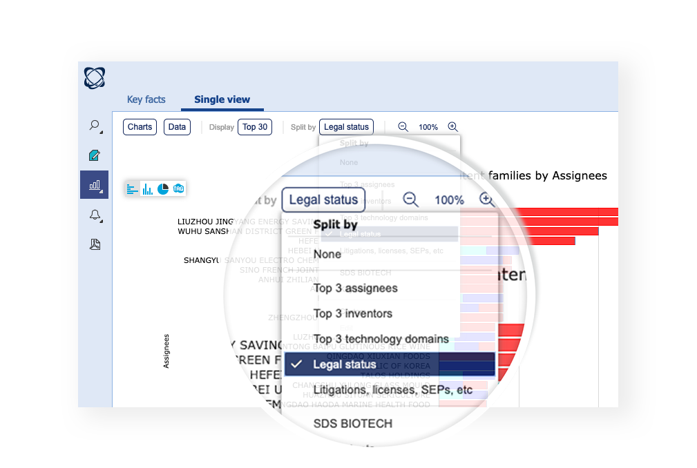
The custom option and any predefined spilt by profiles can also be accessed further down in the same menu.
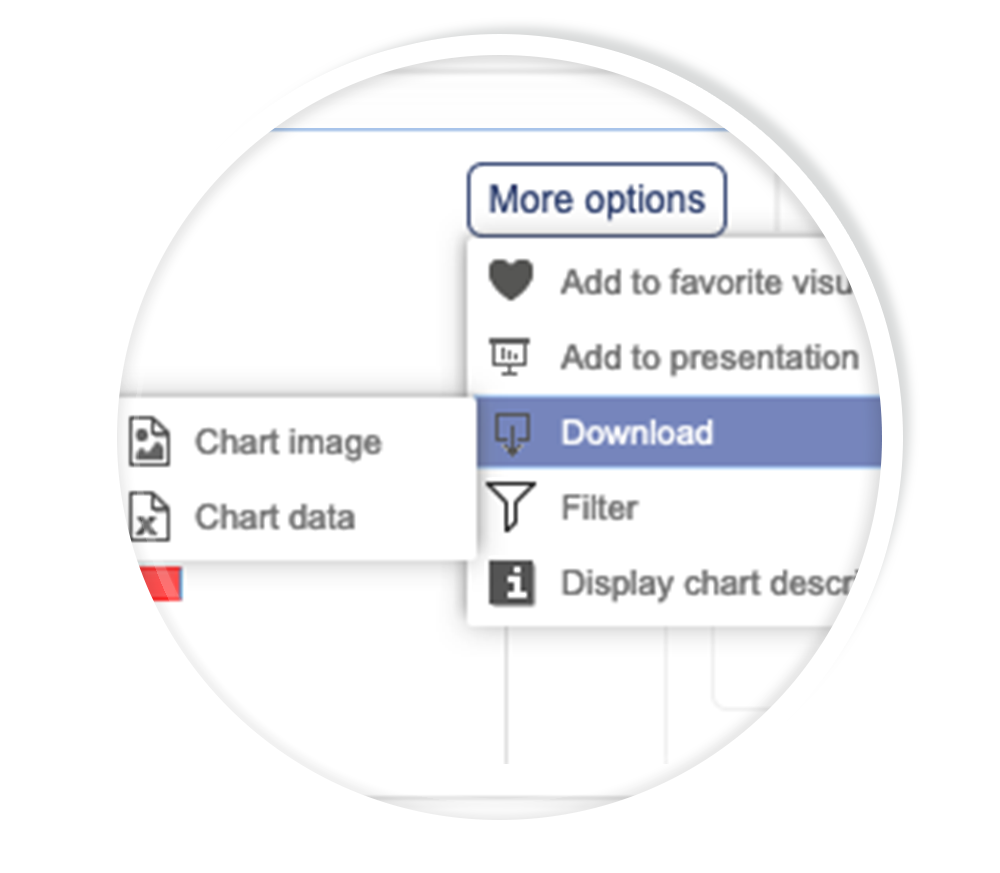
Other chart controls
Finally, all other controls can be found in the menu on right, export, add to favorite charts etc.
We hope you enjoy the new layout. It’s been designed to help both expert analysts and new users make the best of the analysis module.