
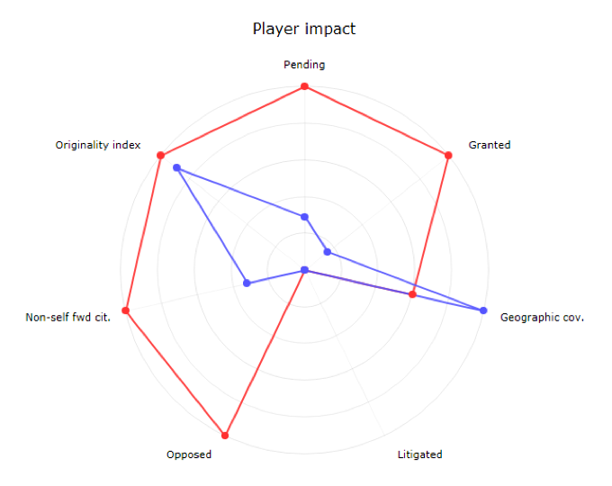
New radar chart in saved analyses
The radar chart is now available in saved analyses for platinum users. Commonly used in sports and other recreational activities, it allows for clear assignee comparisons over carefully selected criteria.
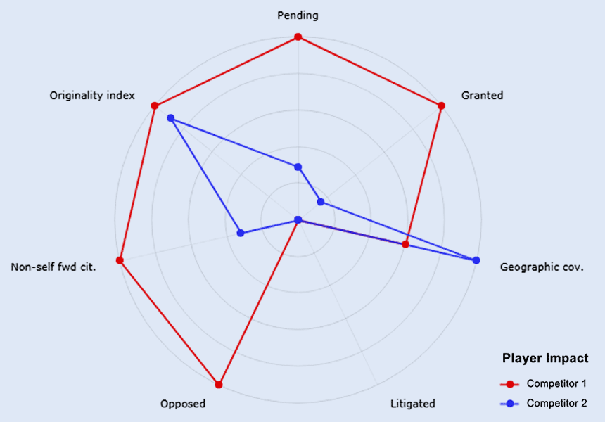
At a glance, we can see that the red competitor 1 has more patents (granted and pending), most likely a technically stronger portfolio (highly cited and high originality index scores), and survived a higher number of opposition than its blue competitor 2.
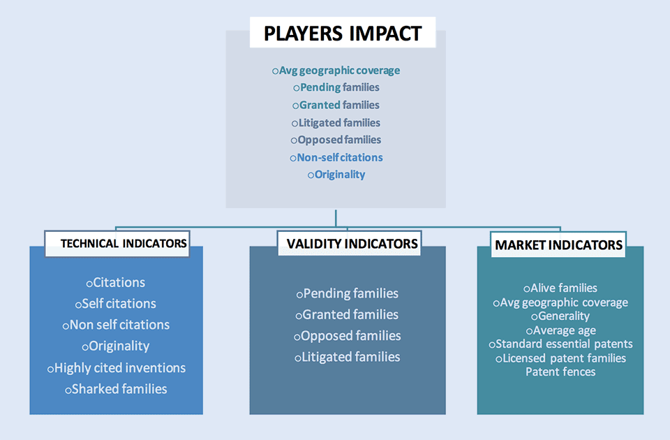
The default radar chart available in “My charts”, completes a series of 4 charts illustrated below.
The Player impact (radar) chart is an overview, while the indicators (tabular) charts are designed to go deeper into technical, market and validity analyses.
The Player impact (radar) chart is an overview, while the indicators (tabular) charts are designed to go deeper into technical, market and validity analyses.
In collaboration with Questel consulting team
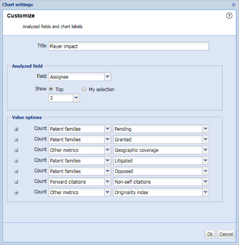
All charts can also be modified to analyze other fields than assignees or display a different set of metrics.
My selection in saved and live analysis
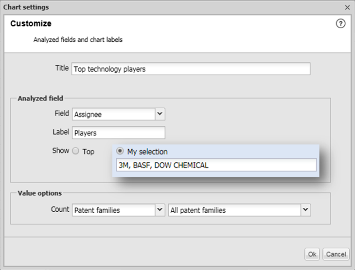
In all saved and live analyses a new ‘My selection’ option has been implemented. This option allows you to select specific entities such as assignees.
For example, selecting assignees of your choice will allow for direct comparison of competitors.
This option makes the custom selection more obvious as it is directly displayed in the pop up.
While this option will be relevant for most charts it will be particularly useful for Player analysis using Radar and tabular charts.