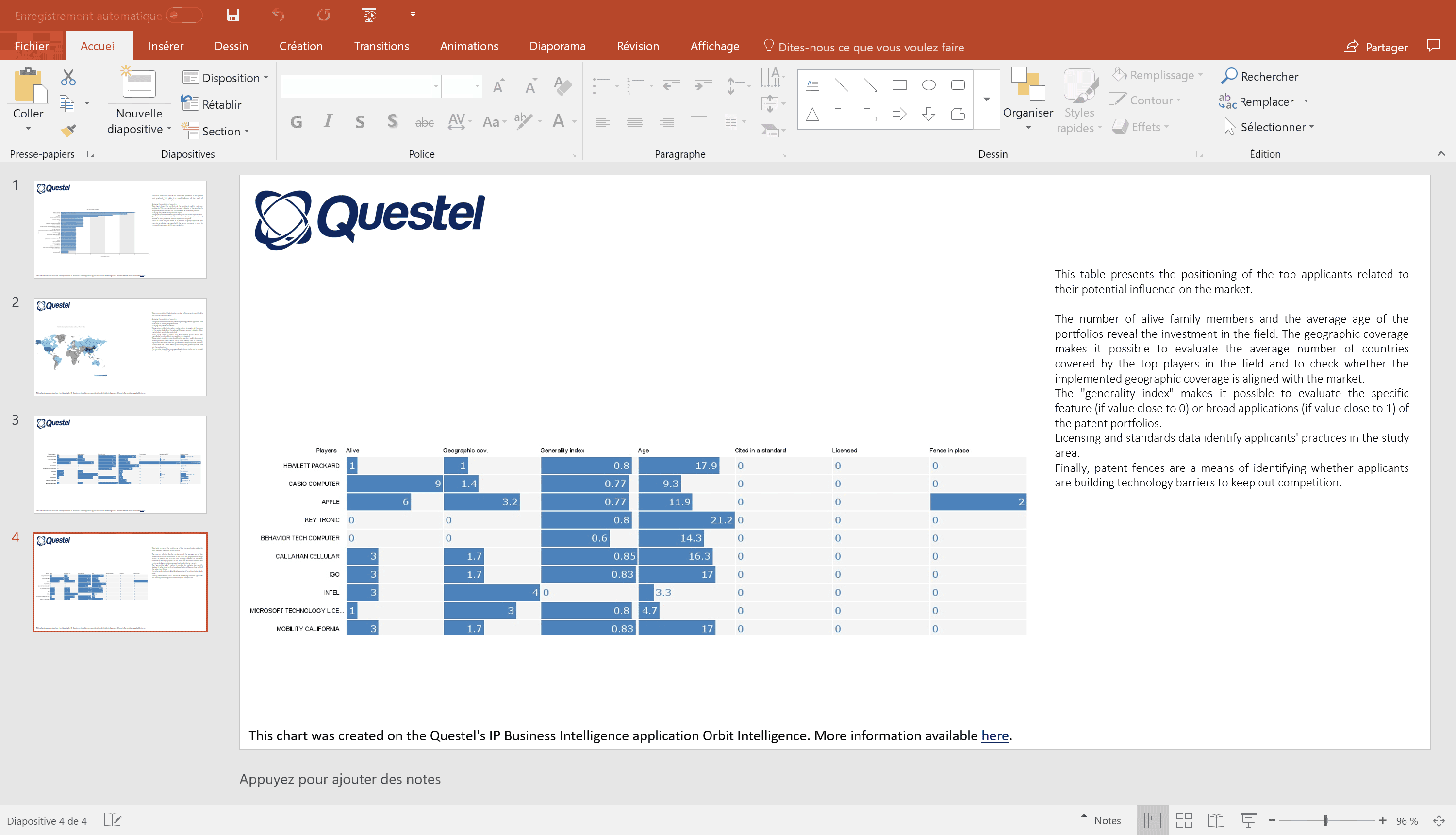
Tabular charts in presentations
Business intelligence is about benchmarking. Comparing your business with your competitors is key.
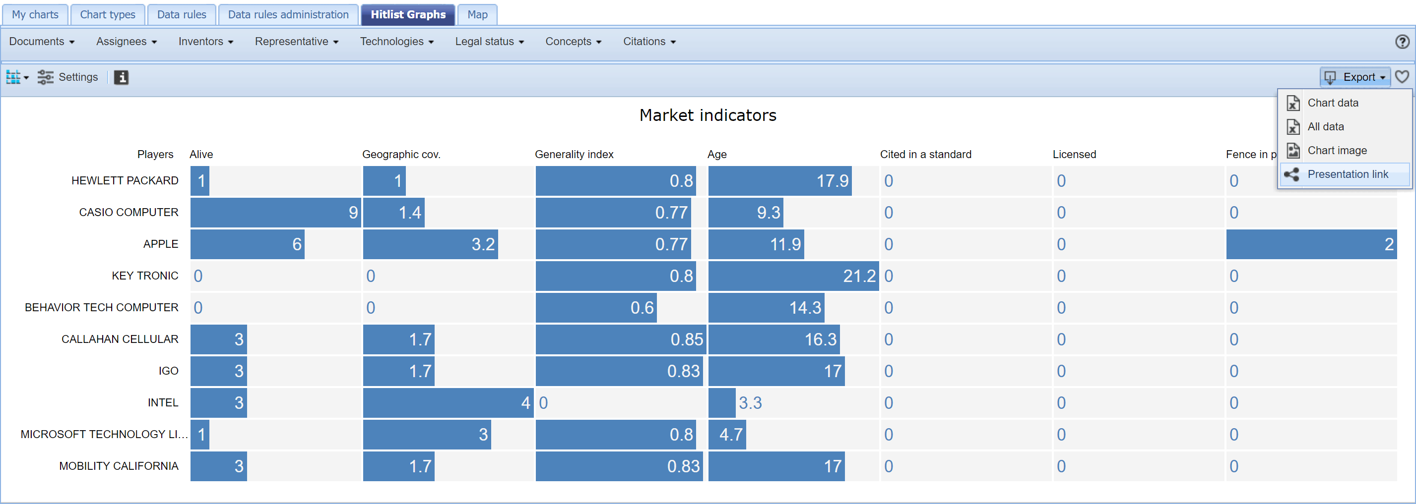
The Tabular chart is a very efficient chart allowing analysts to compare actors on a comprehensive list of metrics. This tabular chart can now be added to a presentation, together with a selection of any other charts.In the Export menu, select " Presentation link ".
To keep adding other charts, just close the following window.
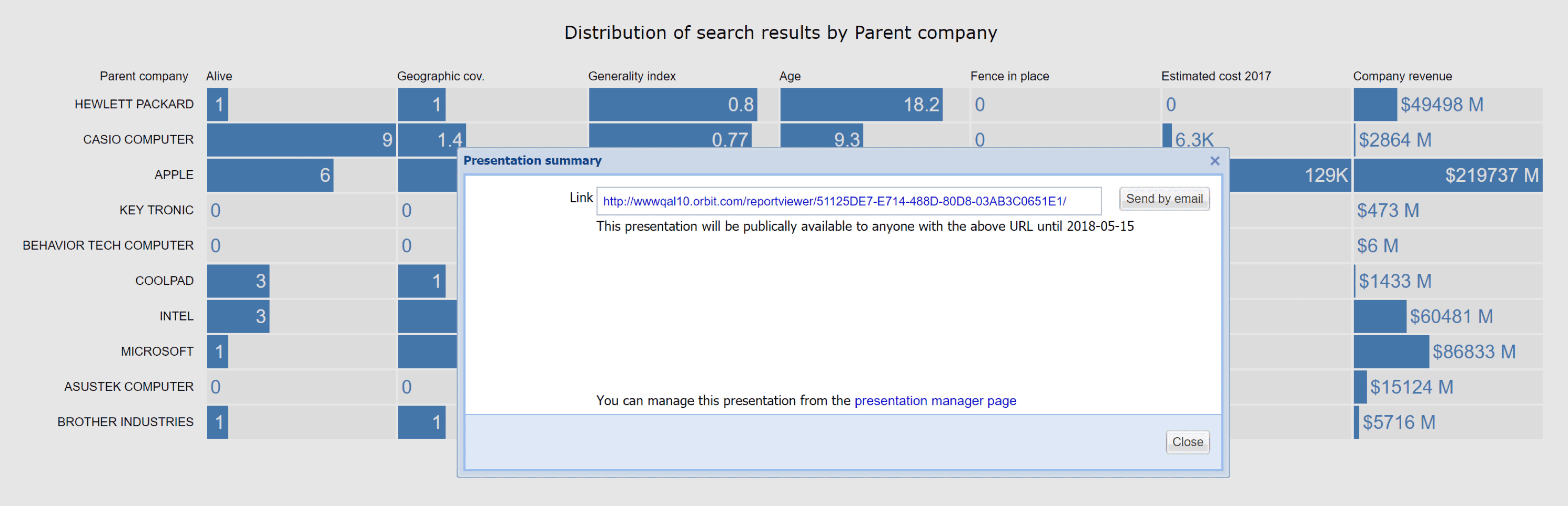
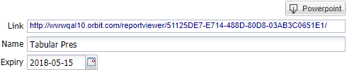
To view the presentation, simply click on the link and start navigating through your selected charts.
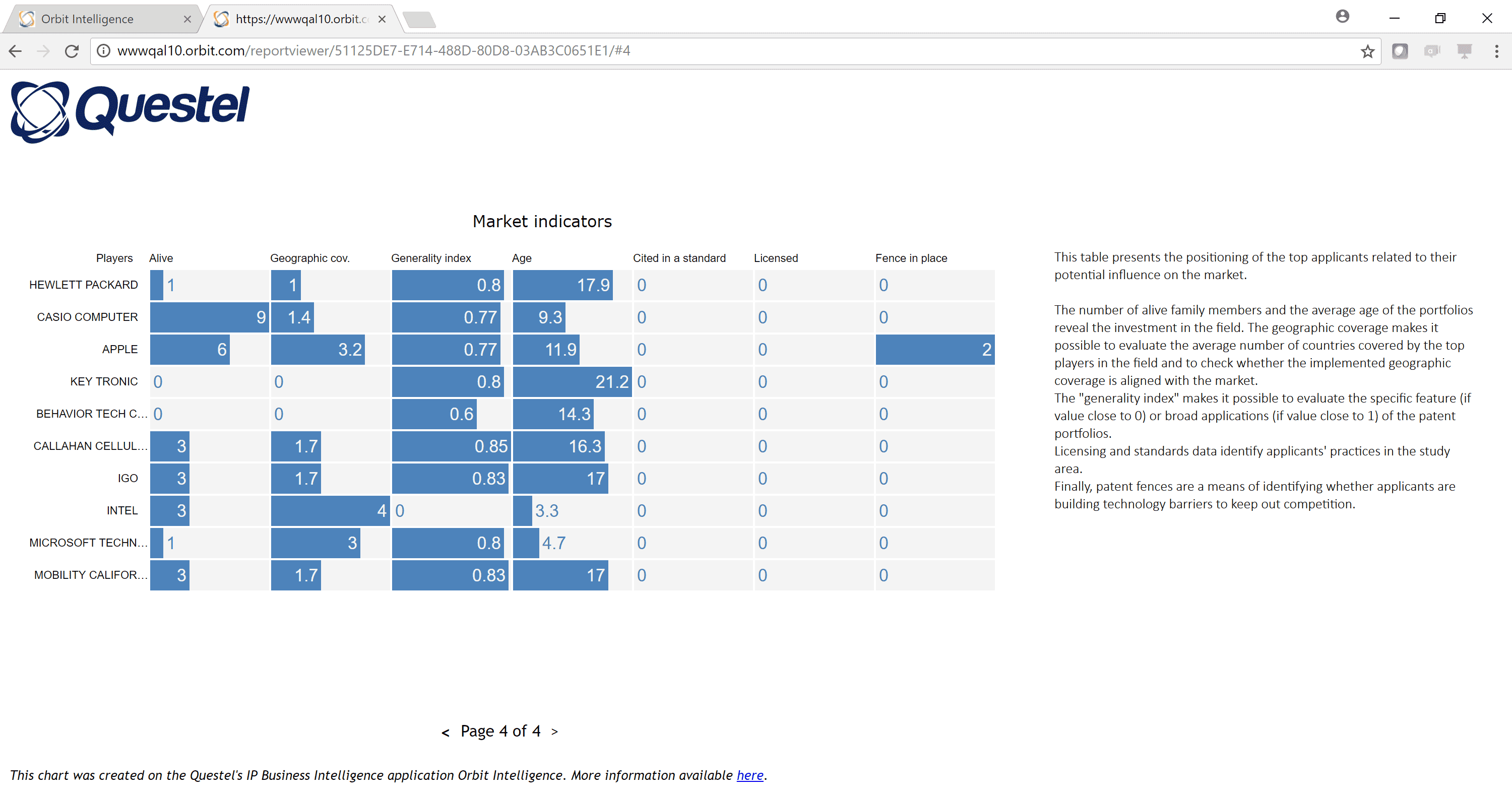
The Presentation manager offers the possibility to copy the link, rename the charts, edit the chart descriptions, re-order the charts, and export the presentation to PowerPoint.
Presentation exported to PowerPoint: